Have you ever walked into a retail store, a museum, an office space, or even an airport, and immediately understood what the company or organization is all about? Have these spaces pulled on multiple senses with compelling visuals, pleasing music, or interactive elements? Whether you realized it or not, you were engaging with experiential design.
You might have heard of experiential design — it’s a concept on the rise in many sectors and industries. But what does it actually mean? Experiential design is both an art and science, aimed at creating a fantastic visitor experience within your space. That definition might seem like a broad one, but that’s a good thing because it leaves space for lots of creativity and freedom to truly capture the core of your brand.
At Eleven Fifty Seven, we specialize in designing and constructing experiential spaces. For these organizations, telling a meaningful story with their space is especially important for reinforcing the emotional and philanthropic connections that draw donors to their work. For your nonprofit, experiential design can not only transform your space, but you can also use it as an opportunity to engage visitors in a captivating way.
Let’s take a closer look at experiential design and how it might be useful for your organization. In this guide, we’ll cover:
Incorporating experiential design into your next construction, renovation, or donor thank-you initiative is an exciting and rewarding way to unleash your creativity and capture your nonprofit’s brand, all while giving your donors something special.
Before we dive into how to implement your own experiential design in your organization’s space, let’s review some of the basics. This section will walk through a few common questions about experiential design.
What is experiential design?
Experiential design is the process of using design to tell a story or to communicate information through your space. The end result engages your viewers while also showing them what your organization is all about. The elements used to achieve this effect can take on any form — including physical, digital, or interactive.
Through experiential design, you can shape how people feel about and interact with your organization.
Why does experiential design matter?
As a nonprofit, one of your highest priorities is engaging your supporters. After sending in one donation or attending a single event, it’s easy for donors to never become involved again. However, by crafting a memorable and compelling space or experience, you are paving the way for your audience to stay interested and to stay involved.
Not only will an interesting space help you keep your visitors engaged, but it also has the long-term benefit of creating a meaningful space that reinforces your mission. The effort that goes into designing an experiential place will do wonders for building lasting relationships with your supporters.
What are the principles of experiential design?
Now that you know the “what” and the “why” behind experiential design, you probably want to know how to get started. As you begin brainstorming ideas for your space or experience, you should keep the 3 principles of experiential design in mind. They are:
Engagement: Probably the most important principle of experiential design, engagement is the entire goal of your space. You want to encourage viewers to read, explore, or interact with your content.
Simplicity: You can have a stunning and elaborate design while still maintaining simplicity. It’s essential that the information and branding that you have on display is easy for users to understand and remember. Prioritizing simplicity in your design is a great way to ensure that your messaging doesn’t get lost.
Impact: Your experiential design should leave a lasting impression — viewers should walk away feeling like they’ve just seen something amazing. This way, they’re more likely to remember your organization and spread the word about something cool that they saw.
Considering these 3 principles of experiential design can make a huge difference in your final product. It will be focused, captivating, and memorable.
What are the types of experiential design?
Because experiential design is a fairly wide-reaching concept, you have lots of options for how you want to design your experience. However, there are some broad categories that you can use to get some inspiration for your space.
Exhibitions design: This type blends storytelling and exhibitions, and is ideal for museums, zoos, other cultural organizations, or even branded displays in universities or hospitals.
Environment-based: These graphics fit in with the environment where they appear. Integrating your design with elements already in your facility can help it feel more natural and you can include more information without it feeling cramped. This option is great for nonprofit donor walls.
Marketing: Most experiential designs can double as marketing, but for major retailers or services, advertising might be their main focus. The layouts of retail spaces or storefront window displays are good examples.
Entertainment-focused: Some forms of experiential design can be entertaining. Imagine a concert or art exhibit as the entertainment-focused forms of experiential design.
Placemaking: Ideal for physical spaces, placemaking is a public display or landmark, like a sculpture. You could also use this option for a donor wall or similar donor appreciation exhibition.
When you’re brainstorming ideas for your display, try coming up with an idea for each of these types of experiential design. This way, you can have a wide array of ideas to choose from, and you might come up with something that you hadn’t thought of before.
Let’s dig into the experiential design process. We specialize in designing spaces for nonprofits and other institutions like universities and hospitals, and we’re going to walk you through our planning process. Here are the steps we follow:
Step 1: Strategy and Planning
With any type of project, you should start with a thorough yet efficient planning stage. During this step, spend plenty of time onsite so that you can visualize your project. Then, you can move into more comprehensive planning. To help, we have designed a list of checkpoints that can guide you during this stage:
Onsite discovery: Explore your space and see if experiential design would be a good fit.
Space planning: Begin measuring your space so you have some parameters for your design.
Recognition strategy: Brainstorm ways to make your experiential design instantly recognizable and relevant to your brand.
Creative brief development: Develop your creative brief, or the strategy for your project. Include details like the project’s purpose, goals, core messaging, and other key information that will assist your creative team.
Once your project is relatively planned out, you can move into the next phase.
Step 2: Creative and Design
This phase is the fun part — you can finally start seeing your idea come together and add in creative touches. During this phase, be sure that you include or consider:
Onsite brainstorming sessions: Get your whole team involved and bring your best ideas to the table.
Look and feel of your space: Ask yourself how you want your space to look to someone who has never seen it before. What will they feel when they see it?
Design development: Work with your team to begin developing your design
Environmental storytelling via graphic design: Pull your nonprofit’s story into your experiential design and images.
Interactive recognition: Add some interactive elements to your experiential design to engage your audience.
Step 3: Build and Install
The time has arrived! You can finally begin constructing your project. Here are some important details to keep in mind:
Craftsmanship: Evaluate the level of artistry of your experiential design.
Project management: Determine which of your team members should oversee the construction of the project.
IT support and training: Get your IT team caught up so that any digital elements of your display are ready to go.
Installation: See your space come to life.
Future update planning: Brainstorm some ideas for how you can update your new experiential design in the future.
Working with Experiential Design Firms
Collaborating with an experiential design firm is a great way to bring your vision to life. With years of experience, these firms can offer advice to nonprofits looking to elevate their spaces. When choosing your firm and beginning your work together, there are a few things you might want to keep in mind:
Past projects: Take a look at the work that this firm has done in the past. Does it resonate with you? Do they have experience in your field? Were their clients satisfied?
Level of involvement: Depending on your working style, you might want to be very hands-on in the design process, or you might want to let the firm take the lead. Either way, communicating how involved you would like to be is an important part of finding a good match.
Communication: It might seem obvious, but open and honest communication with your experiential designer will not only help the process unfold more smoothly, but it will also ensure that the final product turns out how you imagined it.
Creating the space for a productive partnership can help you get your experiential design off the ground and ensure that your message is clear and compelling.
Examples of Experiential Design
Because experiential design has become more popular in recent years, you might be eager to get started. Whether you’re designing a donor wall, turning your hallways into an interactive experience, or adding a more welcoming look to your front lobby, experiential design can truly enhance your facility.
But what might your experiential design look like? We’ve picked out the best examples from our portfolio to show you how your final product could turn out.
Example #1: Ohio Health Foundation
This health foundation chose a light and welcoming ambience to help visitors feel comfortable. Their front desk invites visitors to engage with staff without feeling intimidated.
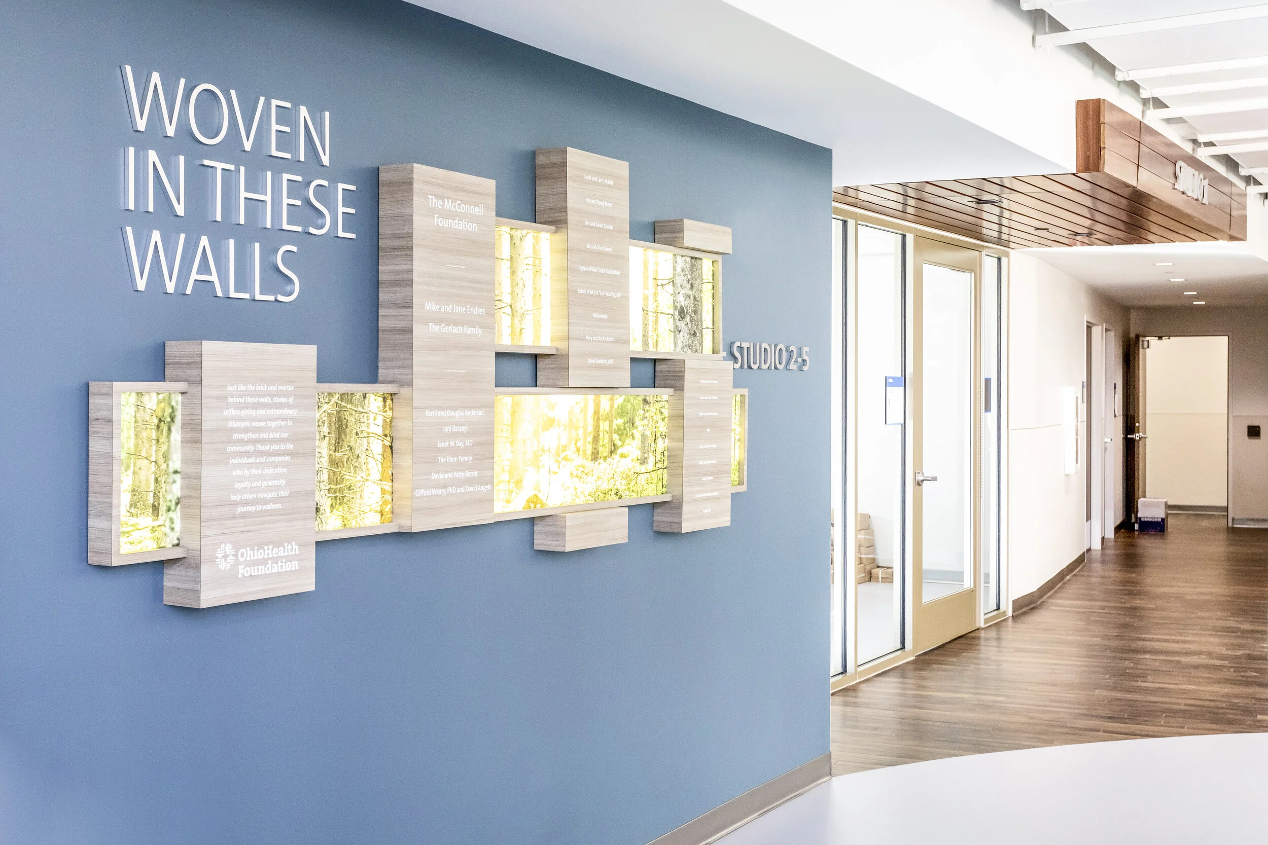
This display extends the experiential design of the front desk to the rest of the facility. The eye-catching images draw visitors’ attention to the design, where they can take a closer look at the names listed.
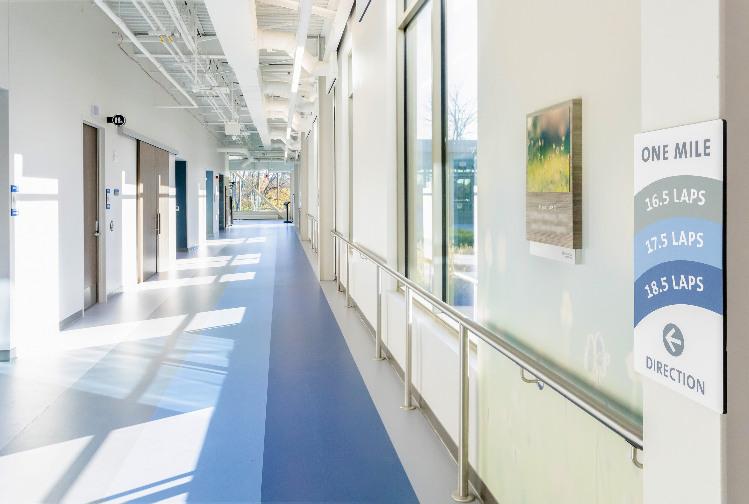
Hallways are another great place to incorporate experiential design into your facility.
The earthy and natural tones throughout this facility provide visitors with a calming aesthetic while also encouraging an active lifestyle, both indoors and outdoors.
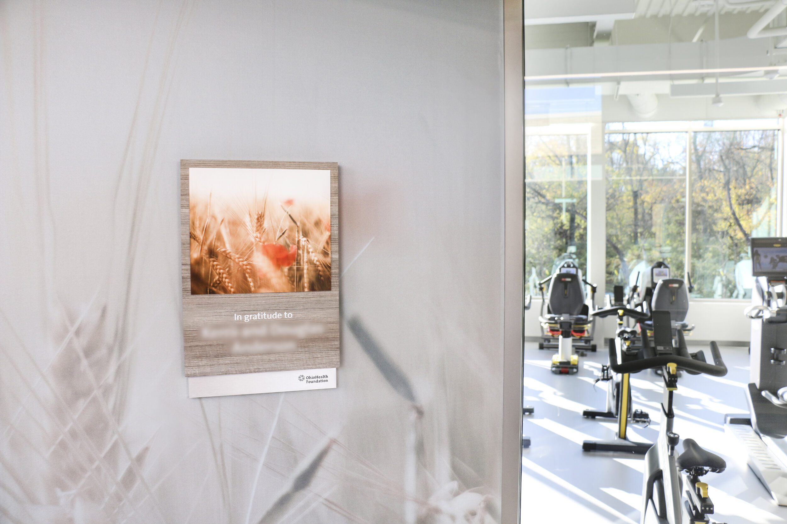
Blending your indoor and outdoor spaces encourages your visitors to explore all parts of your facility.
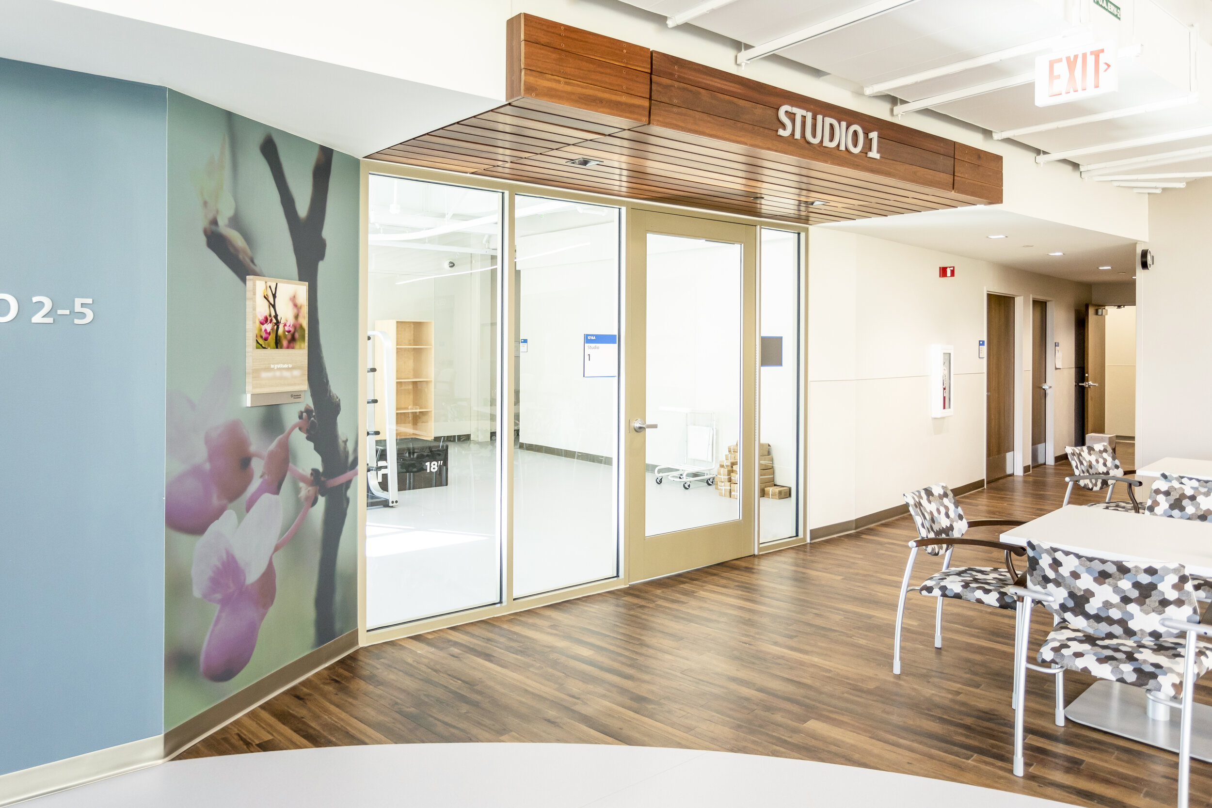
Continuing with the nature theme, this foundation maintained a consistent look and feel throughout its facility. This consistency can really help you build your brand’s associations in the minds of visitors.
Example #2: Appalachian State University
With an open floor plan, this building at Appalachian State University was the perfect spot to create an appreciation display that would attract the attention of students and other visitors.
This appreciation wall weaves together a story, using each donor’s name along the creek-like curving path, which is visually appealing and interesting to study. The wood panels are also a nice addition to the darker wood wall.
Here’s a closer look at the appreciation board. The clear plaques look clean and neat, but also highlight prominent donors.
The longer display is a great way to use wall space while also encouraging students and visitors to follow the path while reading the different plaques. The curving path between the wood panels also maintains the consistency of the other displays in the building.
Example #3: East texas food bank
East Texas Food Bank was in need to create a dynamic yet functional facility to grow volunteer membership to meet the community’s increased demand. Eleven Fifty Seven approached this design with a storytelling angle to explain the Food Bank’s processes, facts about hunger, and how their volunteers are essential for their mission.
The Journey Starts Here ideation is told through a genuine photography style and large graphic messaging.
Eleven Fifty Seven helped further East Texas Food Bank’s mission through a design, build, and install approach. We created an engaging brand experience that was cost effective and featured updatable elements.
In addition, floor decals act as a tour path to guide visitors through the facility.
Wrapping Up
Experiential design can help you to create engaging experiences for your donors, supporters, and visitors. Now that you know all of the essentials, get started today with launching your own experiential design!
To learn more about how nonprofits build meaningful spaces, check out these additional resources:
Donor Recognition Walls: 8 Examples & Complete Design Guide: Want to put up a donor recognition wall but aren’t sure how to begin? We have pulled 8 creative ideas to get you started.
Donor Recognition: Complete Strategy Guide & 13 Ideas: Not sure how to handle your donor recognition projects? We’ve got you covered with these 13 ideas.
How to Thank Donors: Top 12 Ideas & Free Letter Template: How should you thank your donors? Your donors give your organization so much, so figuring out a meaningful way to properly thank them might seem intimidating. We’ve picked our top 12 ideas to help you out.


